
Dräger Service First
2021Agency: DANAMIC (DNMC Creatives)
Team
Art Lead (Myself)
Creative Director – 1
DANAMIC Founder – 1
Project Brief
The project required to create a communications concept, or extend or adapt concept form existing concept “Draeger Service Heroes – We live services. All throughout the world. Every day.”, with a core visual and a headline to:- Elevate importance of, and
appreciation for, Draeger’s Service teams within the entire Draeger
organization across key ASEAN countries
- Promote the good work of the Service
teams in supporting our customers
- Have an internal campaign that is fun and inspiring The concept will be used in an internal communications campaign across key ASEAN countries.
These were some of the final deliverables from our first round of ServiceFirst campaign that I was involved in. It was further expanded into a ServiceFirst video campaign from the set direction that we’ve set at the start.
What exactly did we do?
Basically, DNMC was hired as a creative consultant for the internal comms campaign for Dräger APAC’s ServiceFirst campaign. Through this, we leveraged on our expertise in photography and art directed the campaign. My role in this was to art direct the visual style and direction for the creative director to shoot and style on-site.
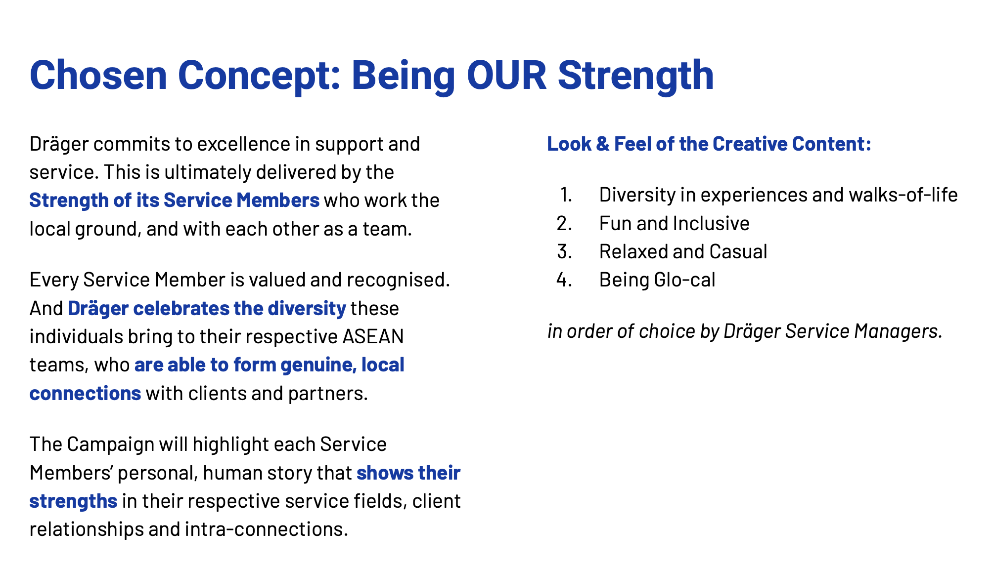
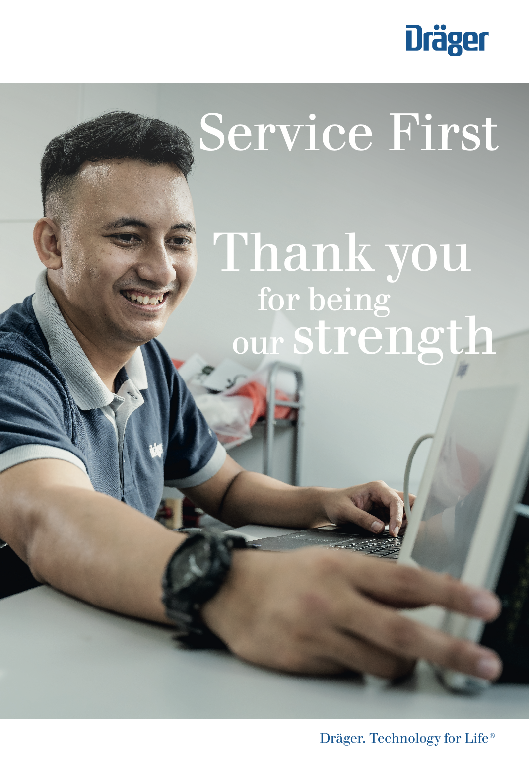
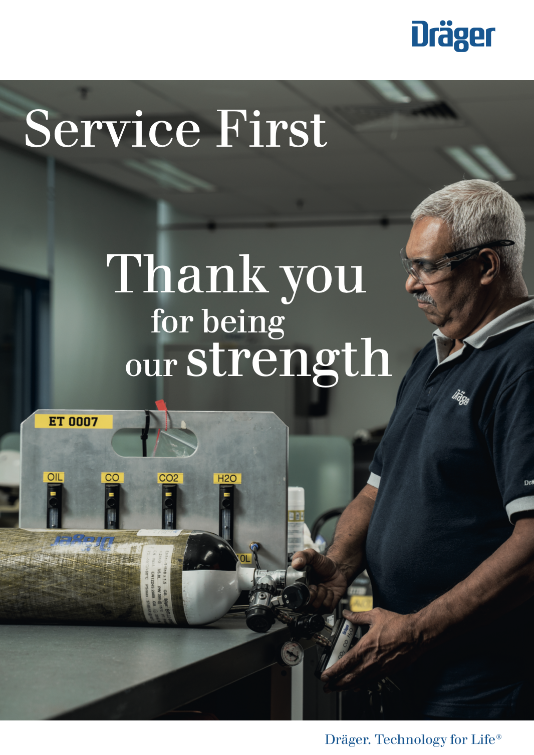
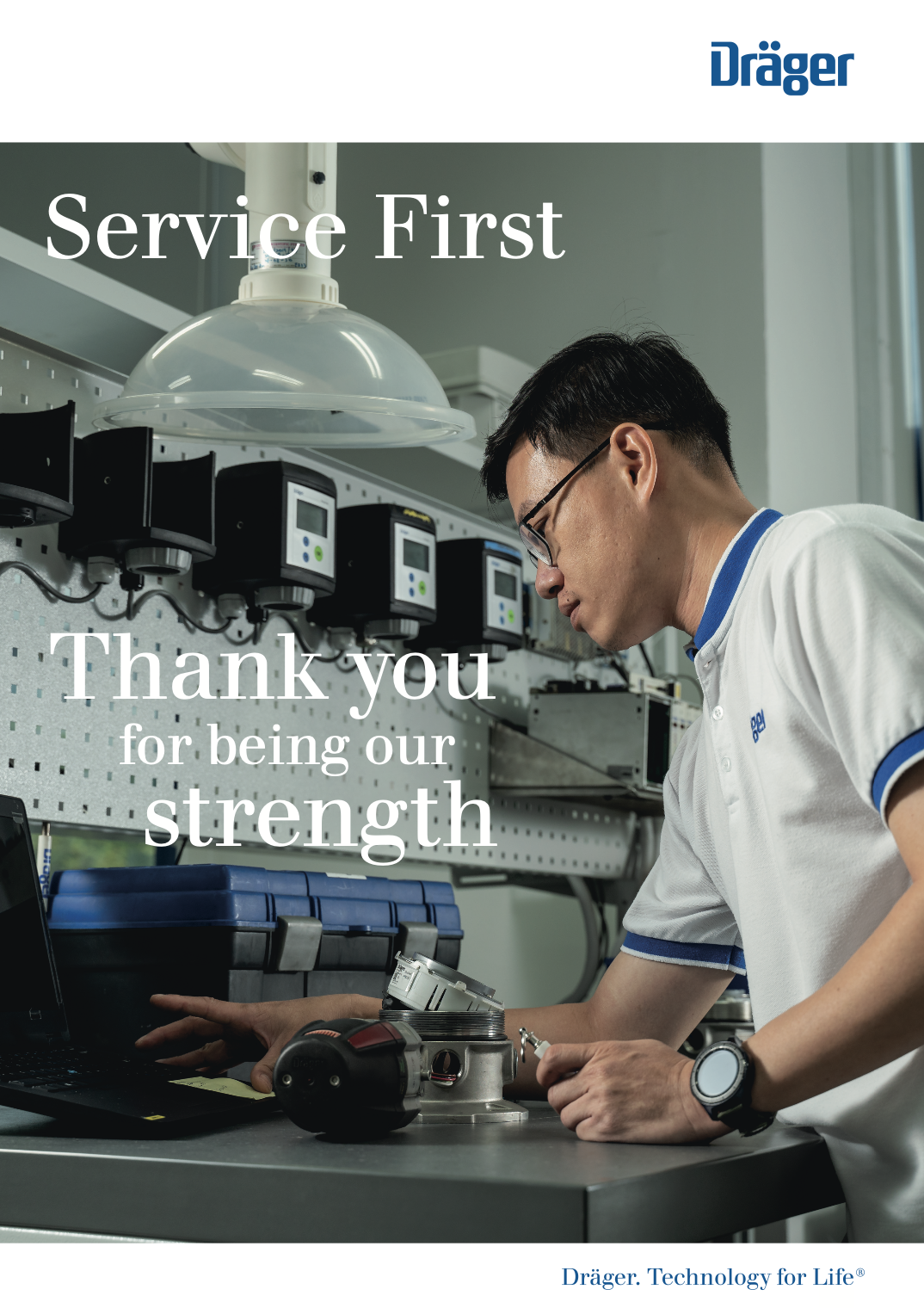
With consultation with the client, we chose and narrowed down the idea of: Being OUR Strength.
From there, proceeded to find actionable items to demonstrate strength. This came with many synonyms that can concretise the idea of strength.
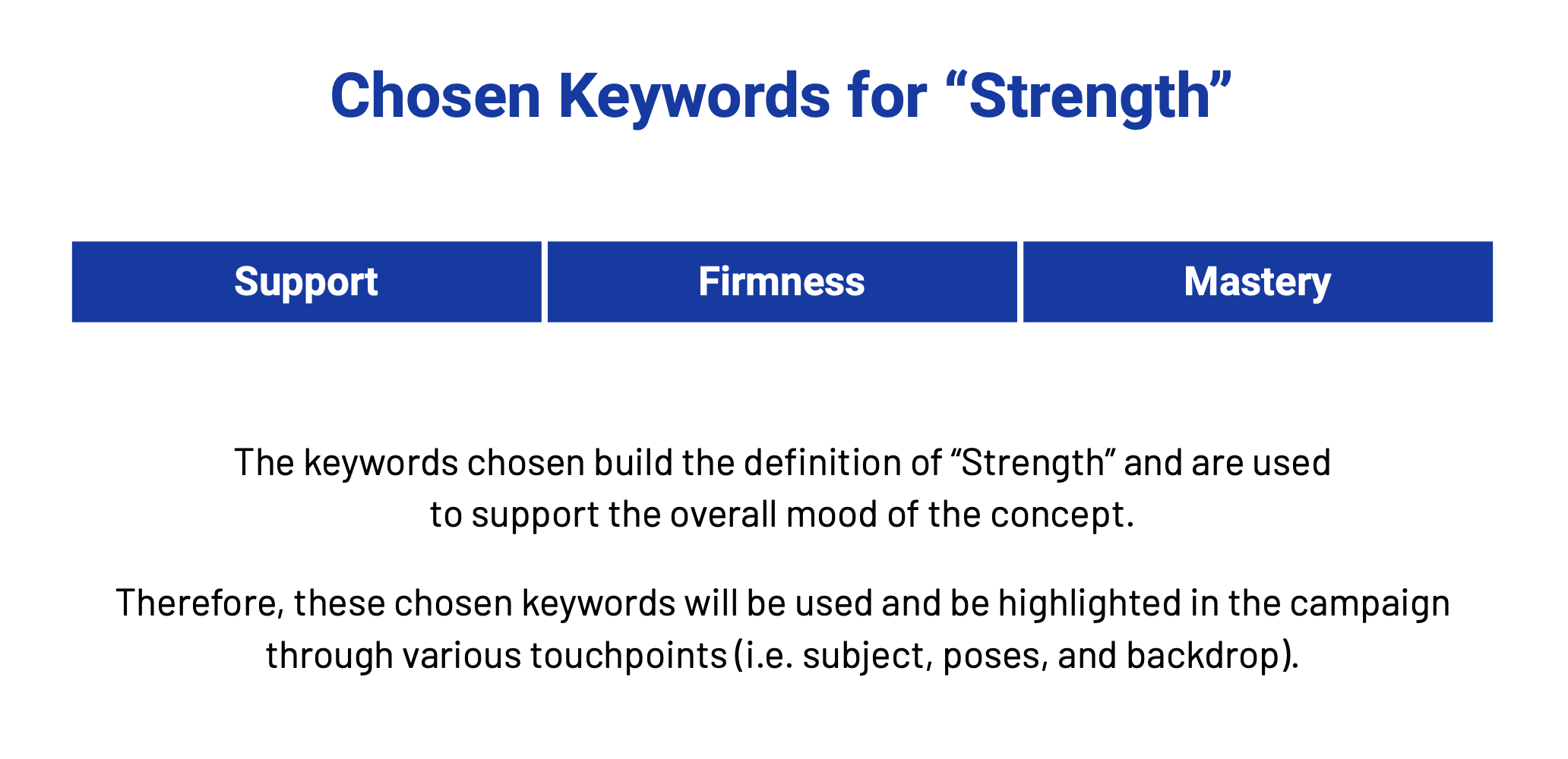

This was because while Dräger get very different skill sets in the departments, the key focus was their strength and to demonstrate strength, I branched it into three branches: support, firmness, and mastery.

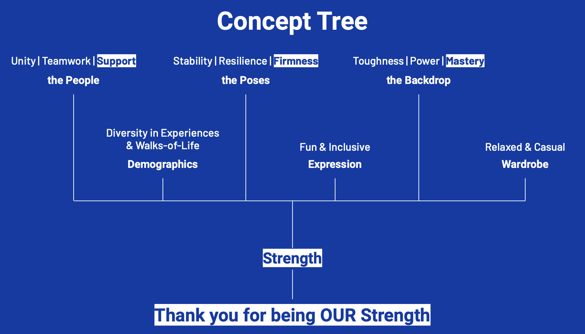
From here, I took the keywords and personified and materialised the strength, and also the mood into the full concept. What is strength in differences? This is all exemplified by the above styling, moods, and emotions.

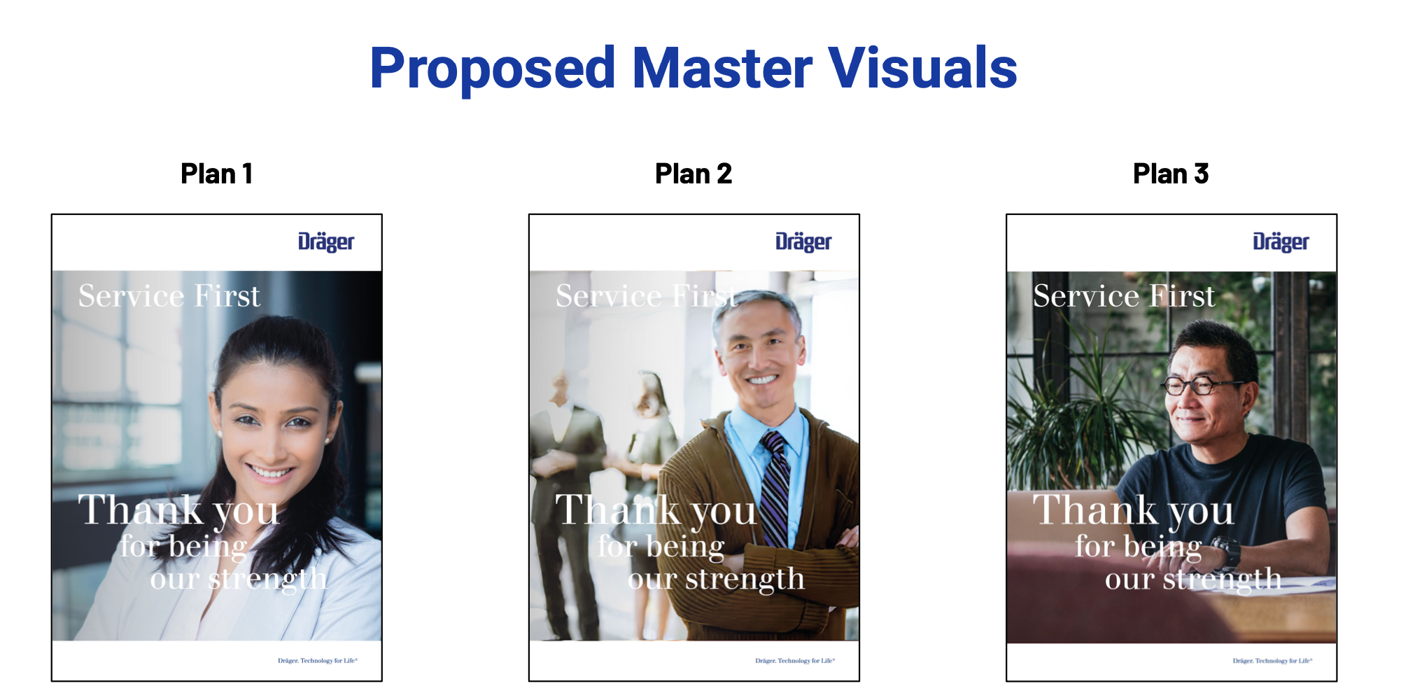
Here’s a sample of how they materialised into 3 distinct visual master plans for our clients to chose from.
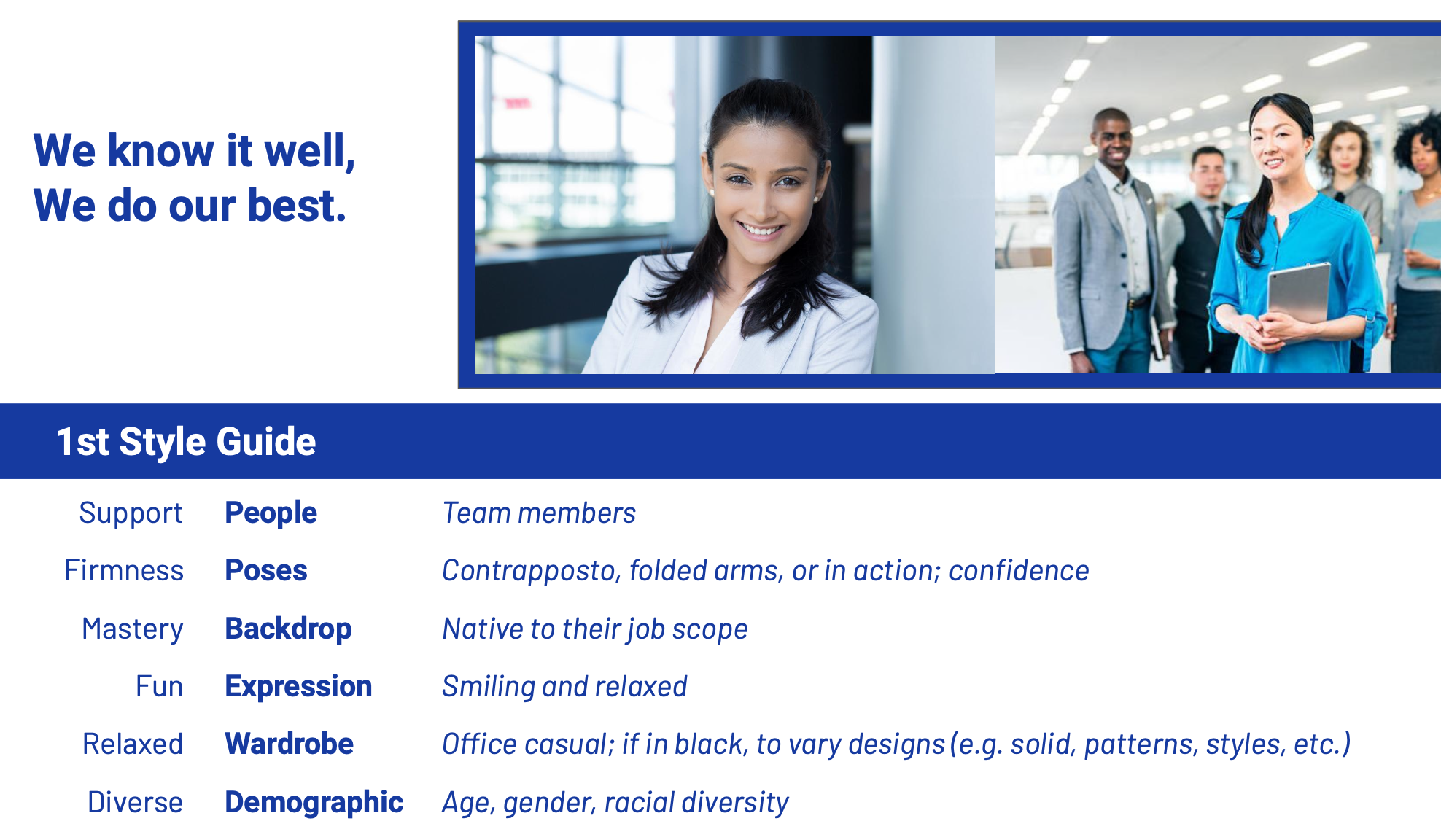
This was a sample of how we described each master plan to be similar but still distinct enough to be different from the others so that the client was able to make a choice.

This was our mock-up for web-banners as well as posters to be used for internal communications.